


 |
 |
|
|
Comment
on this story
What:
2004 Honors Exhibition
When:
Thru June 4. Go to their site for info.
Where:
Ewing Gallery, UT’s Art & Architecture Building, 1715 Volunteer Boulevard
Cost:
Free
|
The Chosen
Honoring graduating UT art and architecture students
by Heather Joyner Spica
For those of us not trendy enough to identify certain trends when we see them, it’s difficult to say to what degree UT’s 2004 Honors Exhibition reflects what’s currently popular in art, architecture and interior design. But this year’s show finds students mining common veins more often, it seems, than have honors shows mounted in previous years.
Familiar threads running through numerous student pieces and projects might reference prevailing tendencies in the present “art world” in general. Or they perhaps reveal the influence of specific professors or good ol’ youth itself—that is, assuming most Ewing Gallery exhibitors were born after 1980.
Before words like “pretentious” or “na�ve” rear their heads, it should be asserted that the influence of youth on art can be a very good thing. It almost always lends art a kind of urgency, be it sloppy or intensely refined; it usually reveals openness to new ideas, to taking chances, and to allowing aspects of one’s work to remain unresolved. It can also mean trying out other people’s approaches before honing in on more individual concerns. And that’s where trends enter the picture, so to speak.
In this 13th annual exhibition recognizing outstanding students graduating from UT’s Art and Architecture department, we see for the first time examples of interior design; fine art participants were selected by a faculty committee, whereas an outside review team sponsored by Tau Sigma Delta helped other faculty-at-large choose the School of Architecture and Interior Design participants.
We also see in this new exhibit some of the trendiness I’ve been alluding to—in what could be labeled “bondage sculpture,” installations drawn from and documenting semi-absurd (dare I say pointless?) activities undertaken elsewhere, paintings plugging geometric objects into settings-of-sorts, incompetent photography presented in nonsensical series, casual smatterings of sketches and the like tracing the artist’s process, “found art” that still seems lost, and architectural drawings and models of flattened, abstract structures resembling carapaces of insects crushed underfoot. Harsh as that may sound (given that my own carapace is hardly impermeable), it at least bespeaks UT students’ awareness of what’s going on around them. And what’s worthwhile is indeed good.
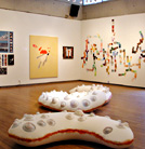
Entering the gallery space, it’s hard to not chuckle at Audrey Russell’s engagingly big latex forms occupying the floor. Studded with colorful pins, her piece titled Large Individuals Installed is both funny and creepy. Its crescent shapes have spiky seams-turned-pink—reminiscent of infected stitches—and the aforementioned pins in growth-like clusters. Similar materials are found in Foam Family Study, consisting of a dozen smallish pieces hung on the wall. Some are framed foam with more stitching and pins, and some utilize wax. Combined as they are, they could be celebrating a transsexual Dr. Seuss character’s gender transformation.
Alisha Kerlin’s adjacent acrylic and oil painting titled Windshield is also whimsical, and it furthermore possesses a Robert Motherwellian sensitivity to what puddled pigment on canvas can achieve. Adam Fotos’ paintings make comparable use of the medium, but they seem less focused than work by Kerlin. Exuberant color abounds, but at times, it’s overwhelming. Like Fotos’ relentless swirls and upside-down drips, it can distract us from the whole. Tchik-tchik Goes to School (a small-scale painting on a grad school application folder) pares down energetic elements enough to have a sense of balance and not clobber viewers with too much of a good thing.
Damien Crisp’s three selected canvases outshine his digital photography, and his handling of very different “subject matter” is admirable. Rocket Queen earns Crisp the T. Rex title award and maximizes rather subtle color to boot. Enveloped, Shinara Taylor’s textile piece a la Mondrian, has no real connection with her small drawings and painted pieces of wood, leaving us to wonder in which direction she’s headed.
In addition to Russell, Amanda Anderson, Nick DeFord, and John Truex are the honored three-dimensional artists, with Truex being the most traditional of the bunch. His Body Armor I is made up of porcelain discs draped over a monolithic, androgynous figure, and it holds few surprises save for the springy energy copper wire lends the pure white shapes it punctuates. Body Armor II is a heavy, brutal-looking structure on wheels containing larger, charred disc shapes bolted and restrained by steel cables. Oddly, the “imprisoned” form does not feel quite tense enough. But it has a powerful presence. Anderson’s images of herself typing letters outdoors using the same cart that’s now in the gallery are presented along with cassette-recorded conversation and a Smith Corona. Maybe the installation would make more sense if we knew what kind of correspondence Anderson has been up to. But we don’t.
Much as DeFord has amusingly obliterated the text in various Harry Potter books—be it white-outed or otherwise—I am herein passing on commentary regarding architecture projects. In the process, I am probably doing students Sarah Gilpin, Robert Hubble, Jennifer Reasons, Amanda Showdens, Jamie Sinz, and Tanya Smith a favor. Suffice it to say that their work, as well as the featured joint interior design project by Lauren Cox and Julianne Pavlovsky, leaves viewers wanting to see more of those divisions’ efforts. As we will. Every year affords us an opportunity to sample what faculty members and other individuals consider the cream of UT’s art and architecture crop. And each year’s chosen students deserve congratulations.

May 13, 2004 • Vol. 14, No. 20
© 2004 Metro Pulse
|
|
